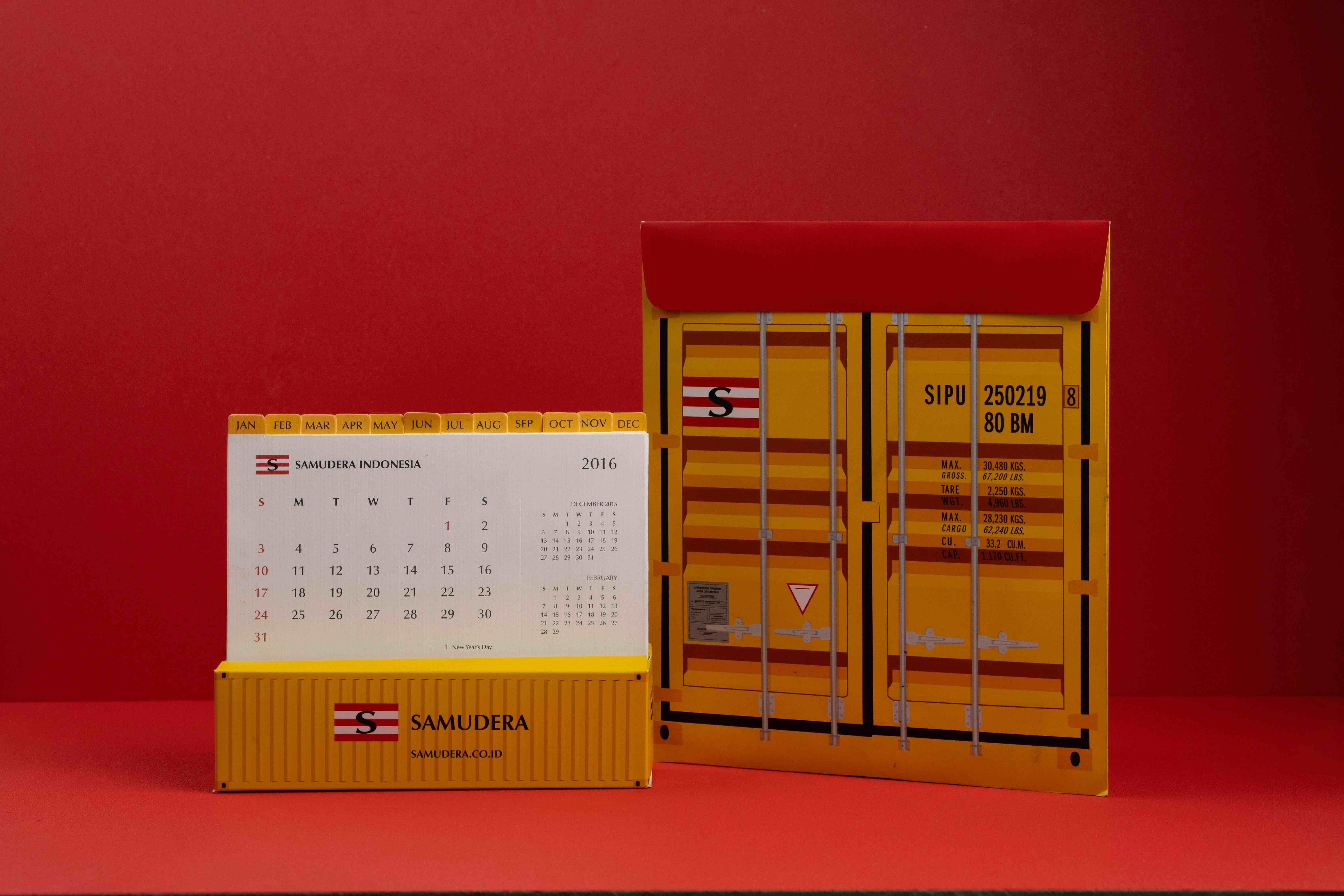
Samudera Indonesia
A 51-year journey connecting Indonesia
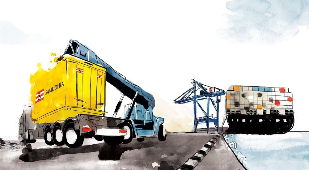
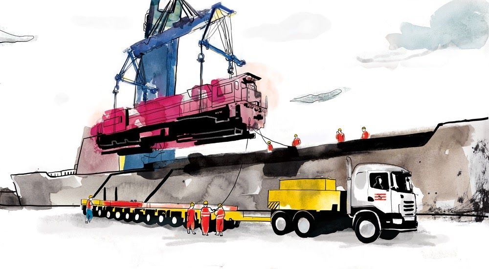
In 2015, we designed a desk calendar to tell the story of PT Samudera Indonesia Tbk and its pivotal role in shaping Indonesia’s transportation and logistics industry since 1964.
We adopted a watercolor style to reflect the company’s expertise in navigating the unpredictable nature of logistics industry.
- Client
- Samudera Indonesia
- Type of Work
- Branding
- Work Category
- Graphic Design, Illustration, Copywriting, Photography, Printing Production


Next Project
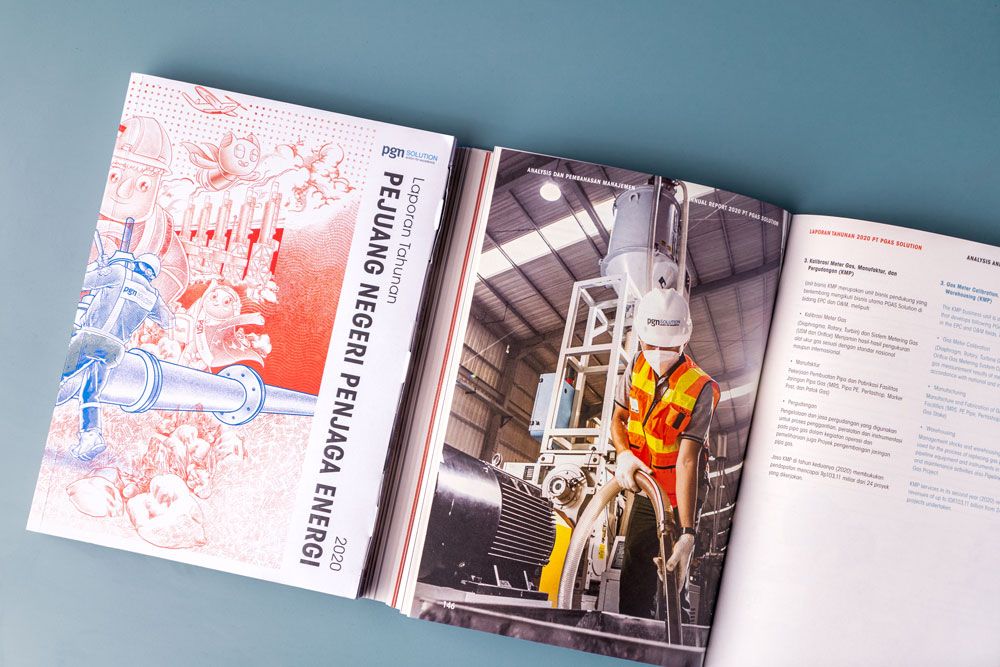
PGN Solution
Dedication for the nation, breaking through limitations
Our 2020 Annual Report for PGN Solution tells a story of resilience and dedication.
As a company that provides integrated solutions in energy infrastructure, engineering, and technology, PGN Solution continues to ensure reliable energy distribution across Indonesia, even in the face of a global pandemic.
We intentionally used only two colors, red and blue, to symbolize both strength and stability. This self-imposed limitation became a visual metaphor that even within restrictions, creativity and excellence can still thrive.
To deepen the concept, we applied an anaglyph optical illusion on the illustration, reflecting PGN Solution’s commitment to deliver excellence and innovation during challenging times.